Twister catering
FRESH CATERING
Because of the development of the company and introduction of the vegan option to the offer Twister catering company decided to change the visual identification completely.
Our goal was to refresh and modernize the image of the company by keeping in mind the latest trend of the company and the modification of the brand’s philosophy.
TWISTING GEOMETRY
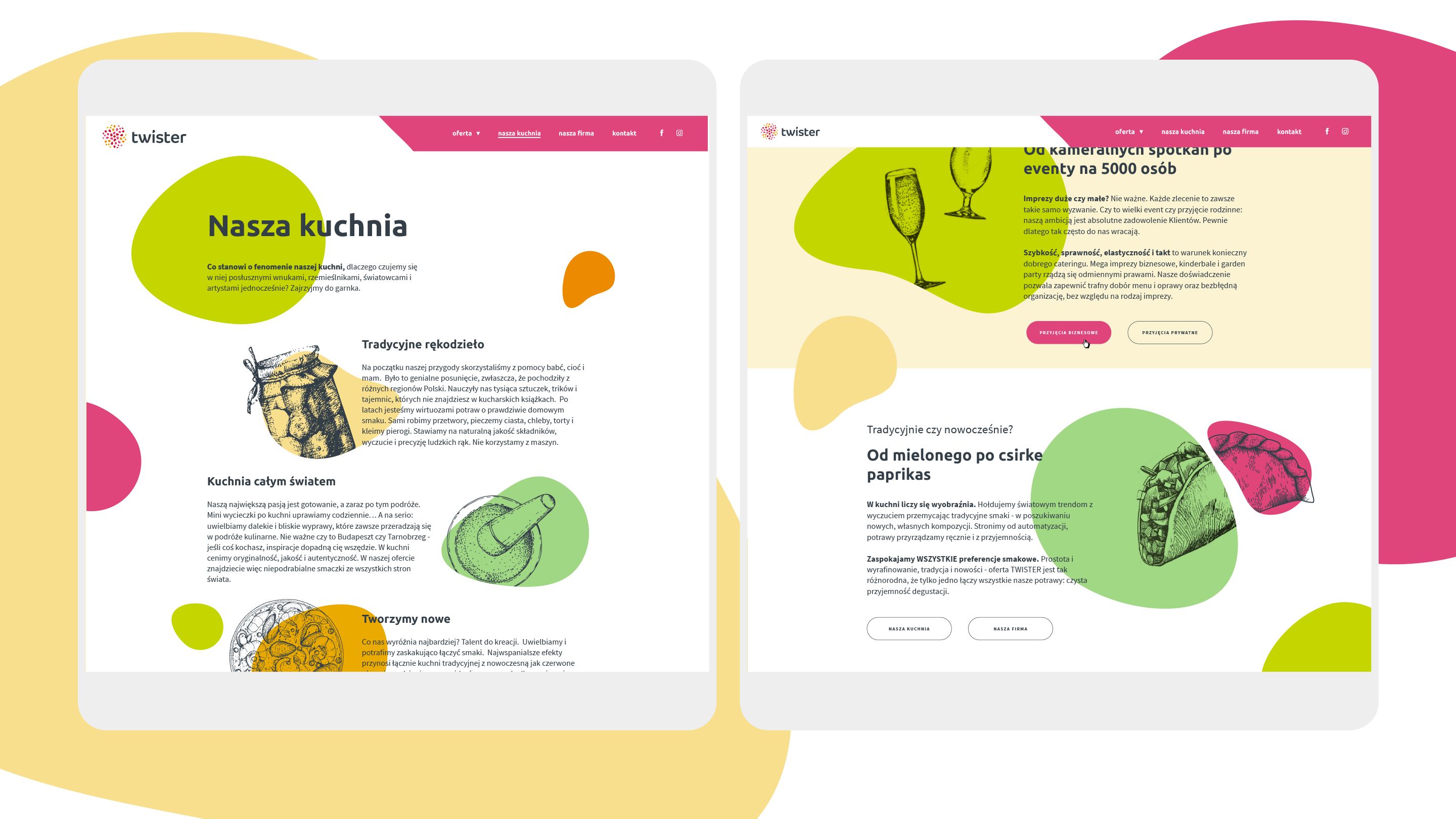
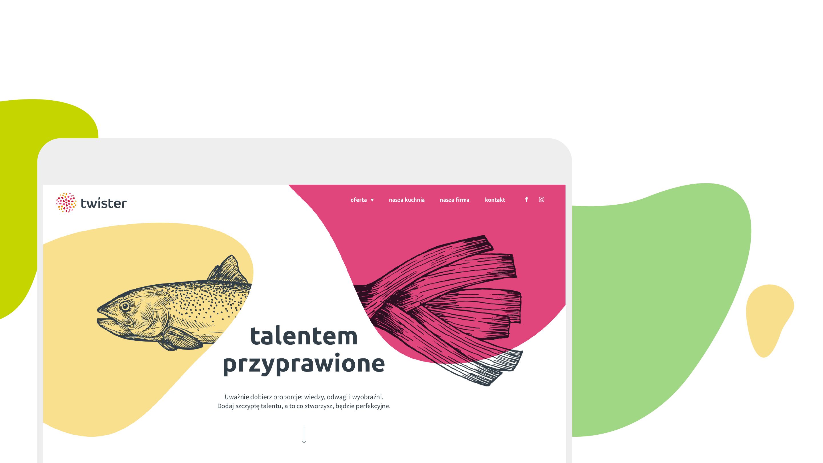
Cooking – just like designing – is a complex activity. That is why the logo symbolizes the abstract fusion of flavours which emerges when preparing food.
The graphic symbol was the starting point – afterwards we created the website and marketing materials. We emphasized the connection between tradition and modernity by joining geometrical forms of the symbol with images of the culinary products.
'2018