Ceramstic
KAMIEŃ MILOWY
Dzięki współpracy z agencją PR Public Dialog, mogliśmy podjąć się rebrandingu marki Ceramstic.
Kadrowane łuki tworzą literę „C”, nawiązując do inicjału marki, a swoją otwartą kompozycją zapraszają do zabawy multiplikacją wzoru, tak jak układa się płytki ceramiczne. Dynamika i ustawienie elementów znaku dyskretnie kontynuują poprzednią identyfikację marki.
WZÓR DLA WIELU
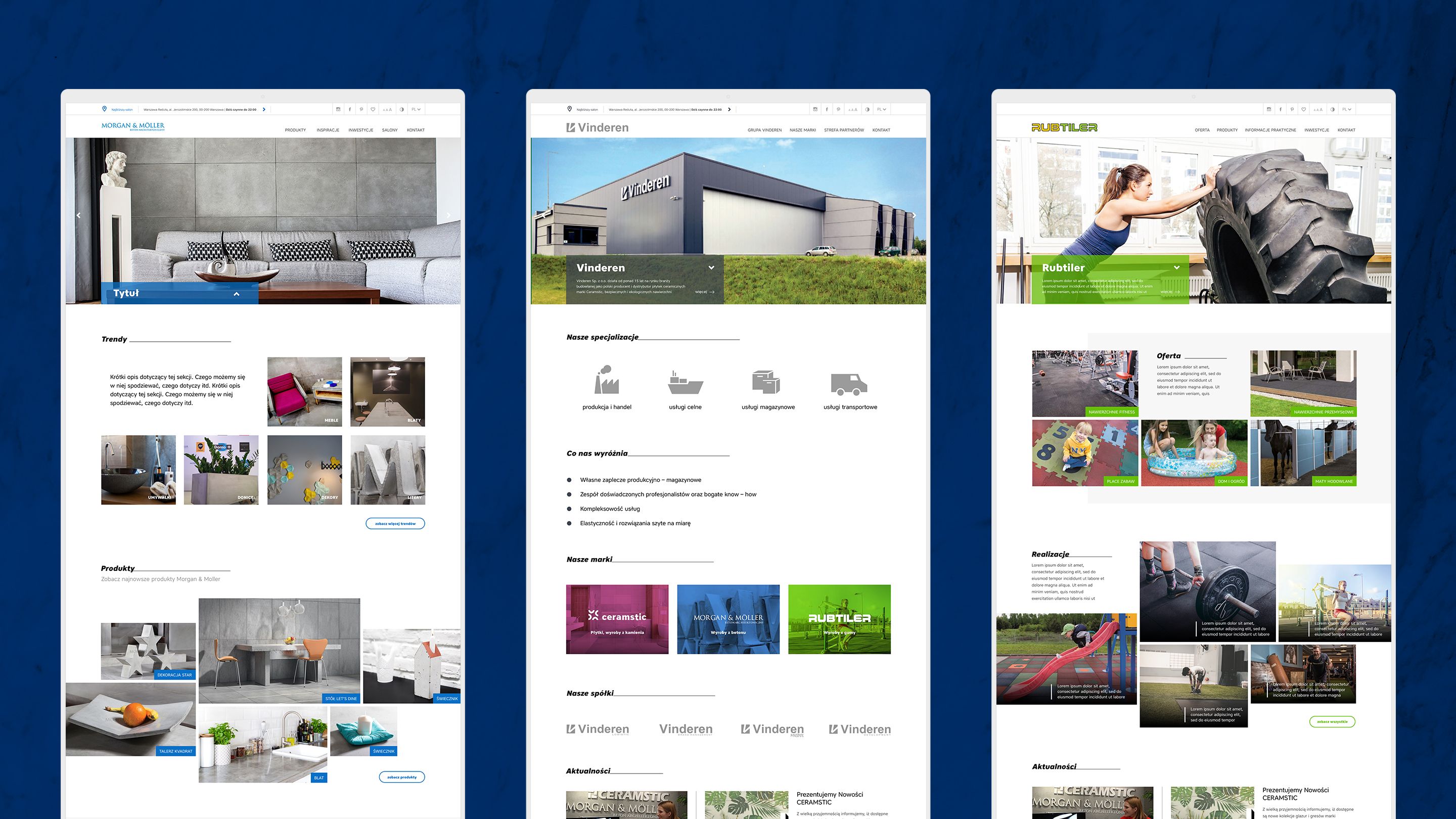
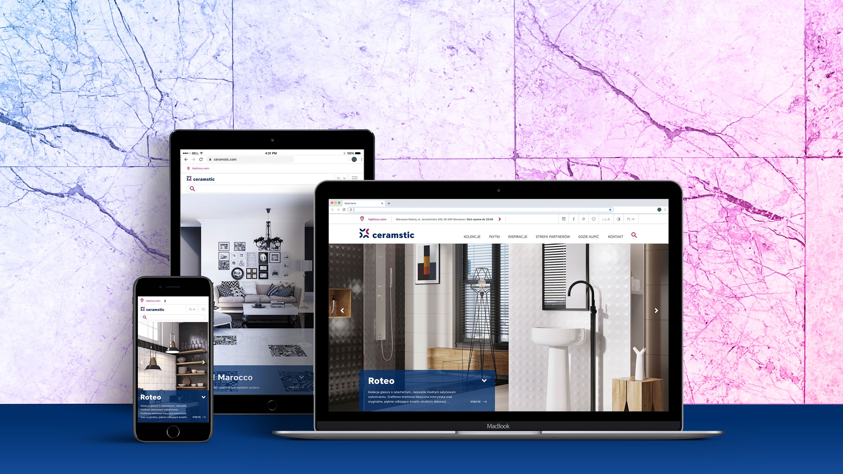
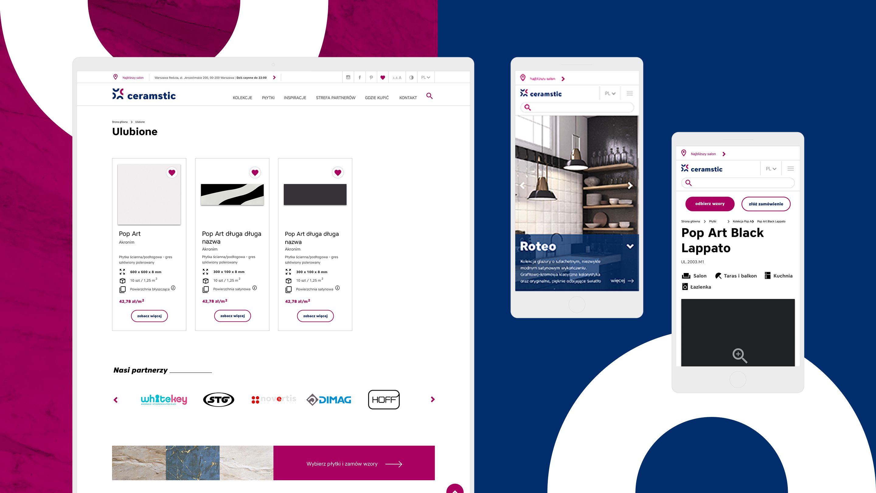
Oprócz rebrandingu, naszym zadaniem było uspójnienie wizerunku firmy Vinderen w internecie. Tym sposobem tworząc stronę Ceramstic, musieliśmy zaprojektować architekturę informacji dla pozostałych 3 serwisów: Vinderen, Morgan & Möller oraz Rubtiler (proces wdrożenia trwa).
2019 r.