SimFabric
Simulation factory
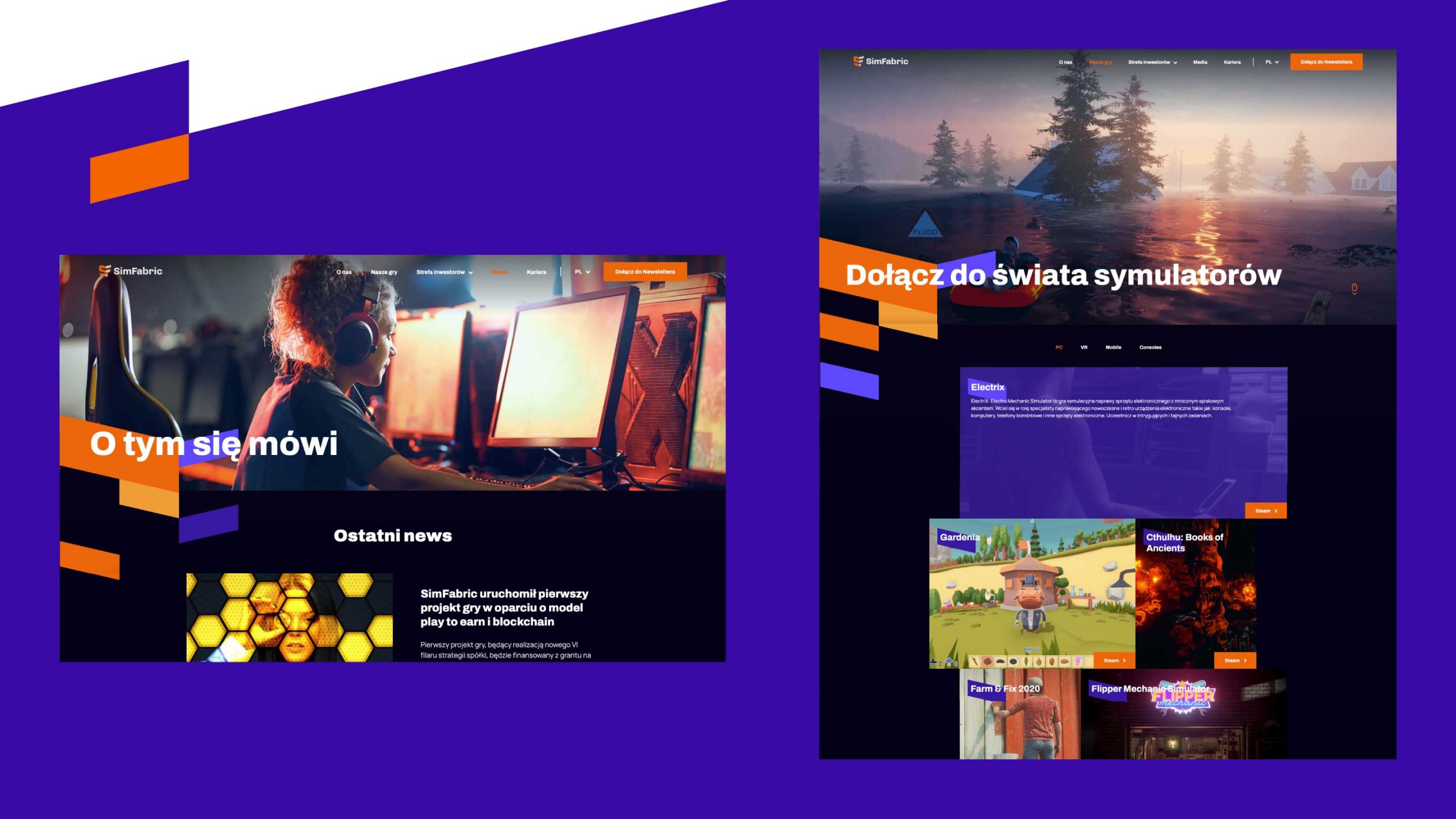
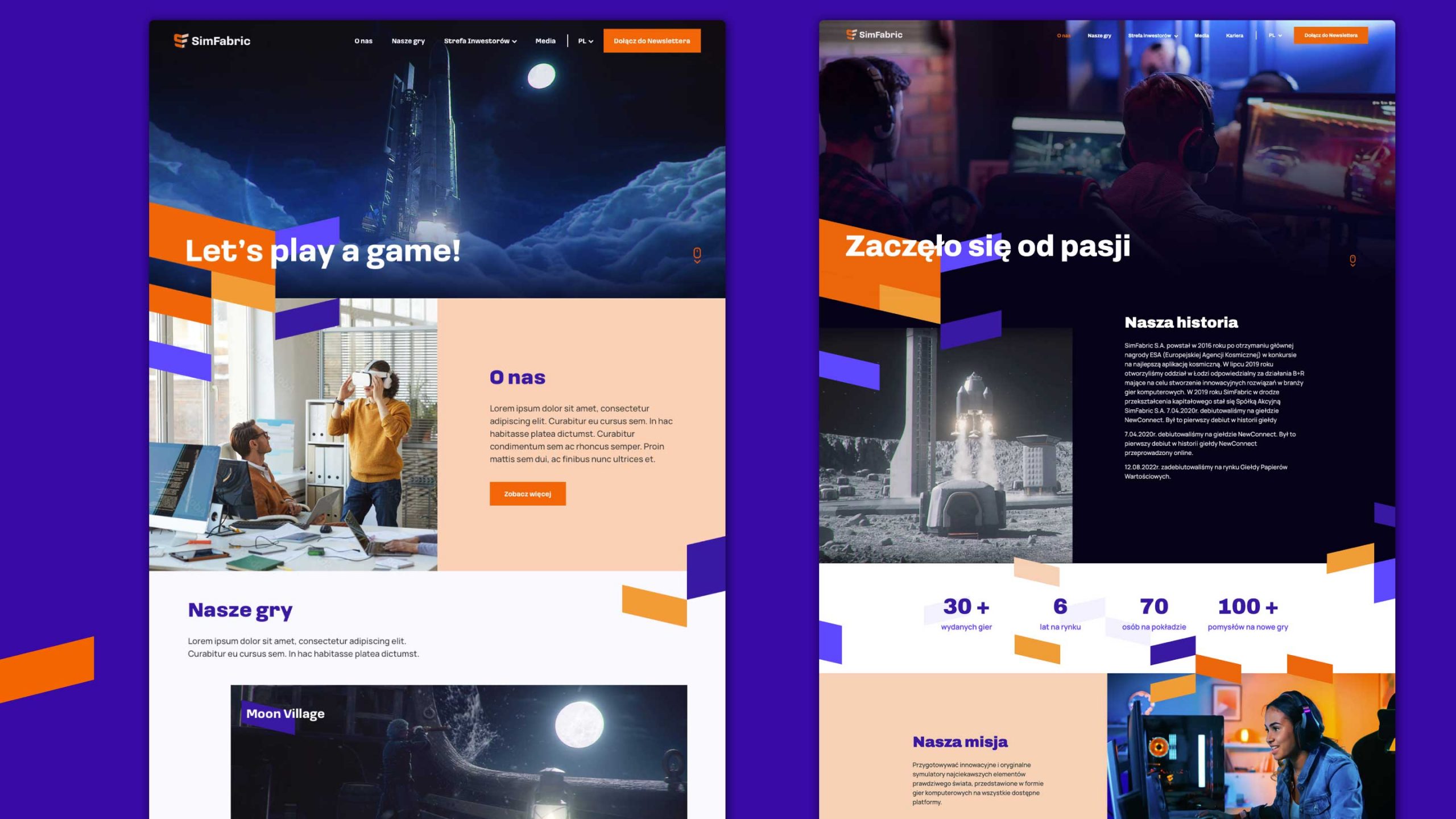
Rebranding of a young, thriving company – publisher, producer, game porting studio, creating simulators and games for PC, mobile devices (iOS, Android) and VR goggles.
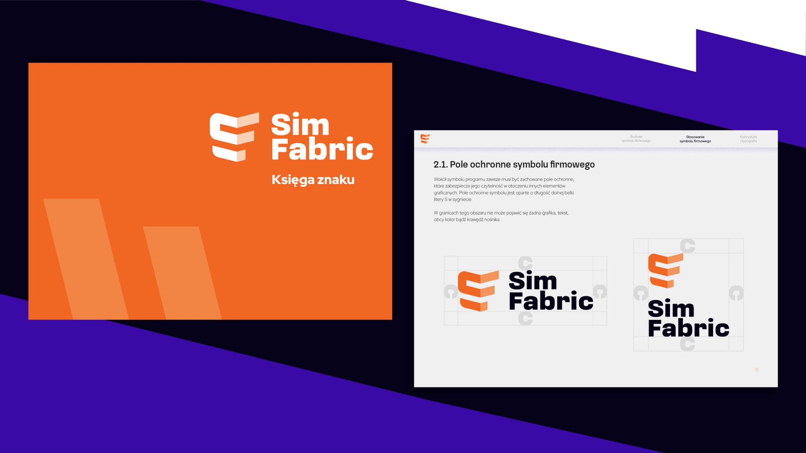
The mark is a compilation of initials inscribed in the shape of a cube. This resulted in a spatial, massive and stable mark referring to the multidimensionality of the company’s activities.
The new emblem represents a bending of spacetime, a transition into another dimension. It is composed of modules that enable the creation of limitless 3D worlds.
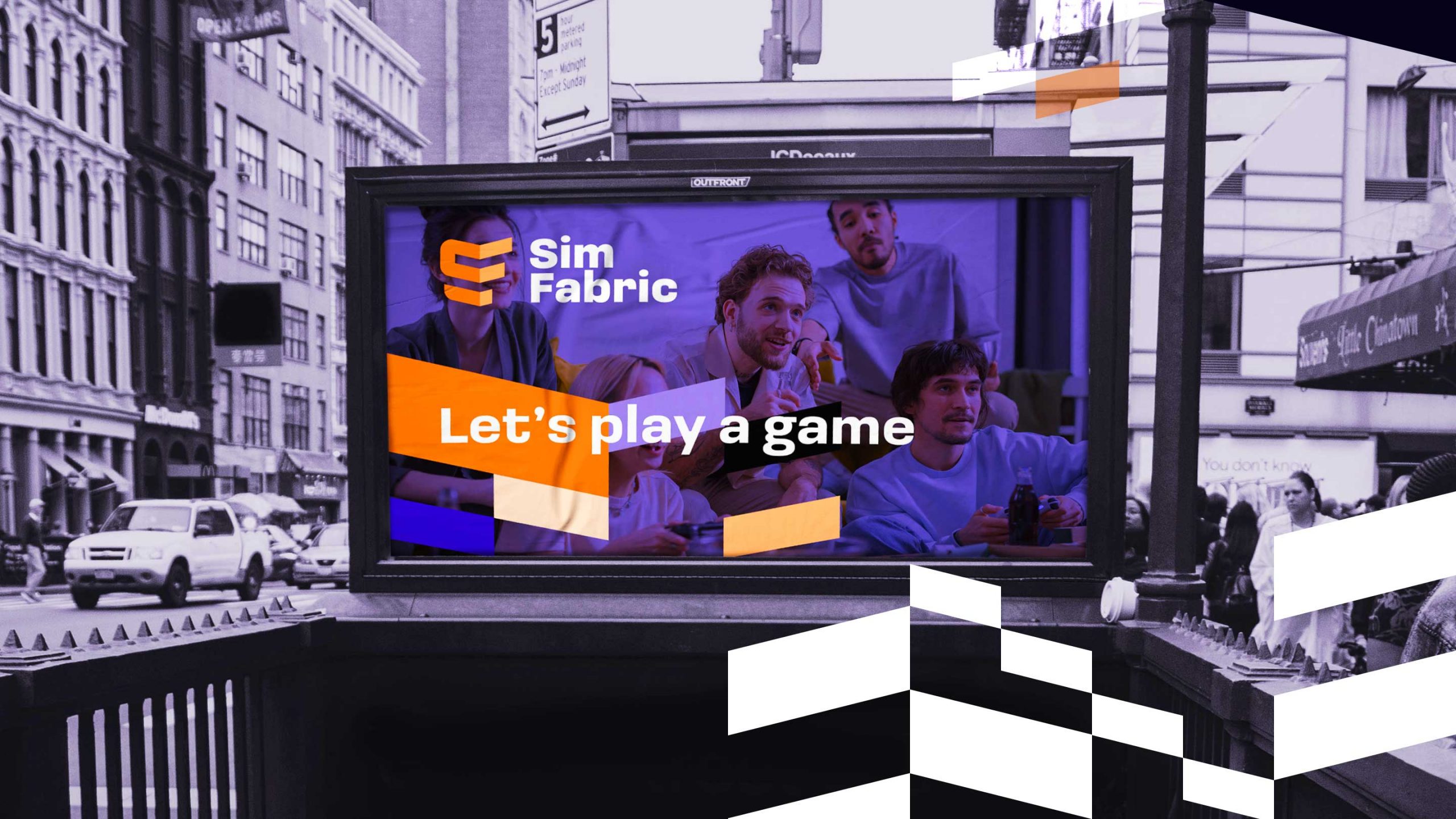
Energy and creativity
The combination of orange and complementary purple was deliberate. Orange represents optimism and energy derived from the “old” identity. We added bold purple – the color of mastery, artistry, creativity, but also prestige and authority.
Designed
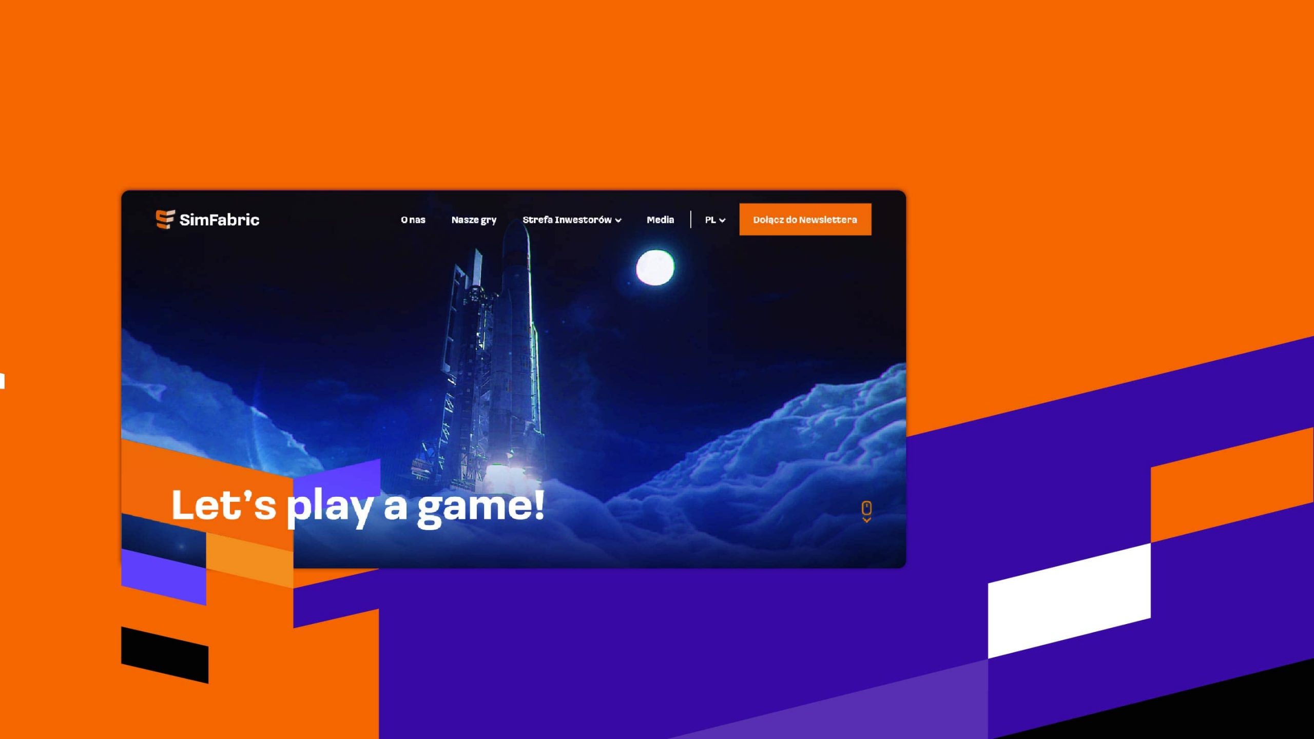
We created a new logo as described in the Brand Book, Key Visual of the brand and an image-focused website. The design process included UX workshops with the client, an interactive mock-up, and a user-friendly design.
2022