Prodialog.pl wellbeing
Dialogue is the key
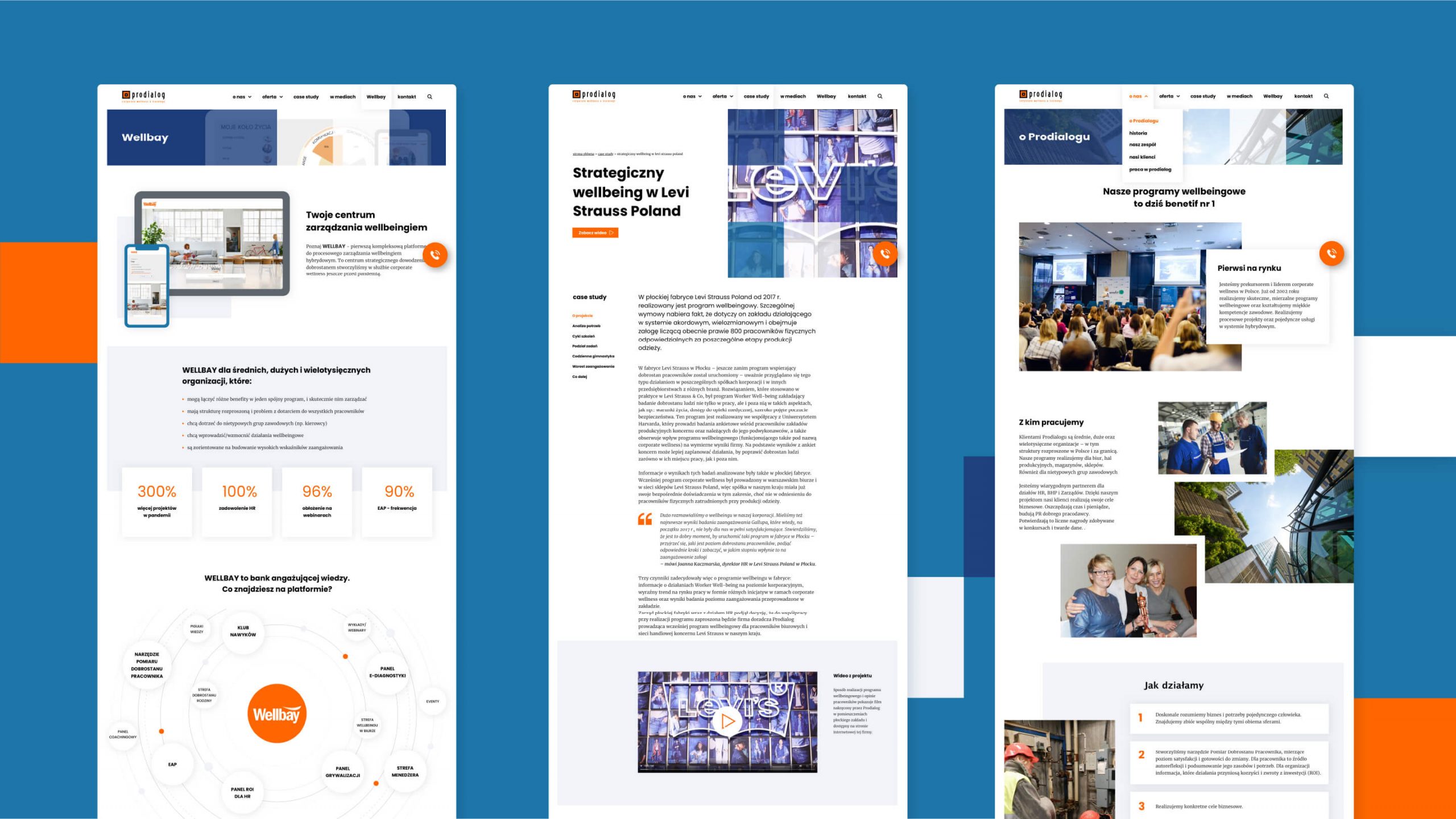
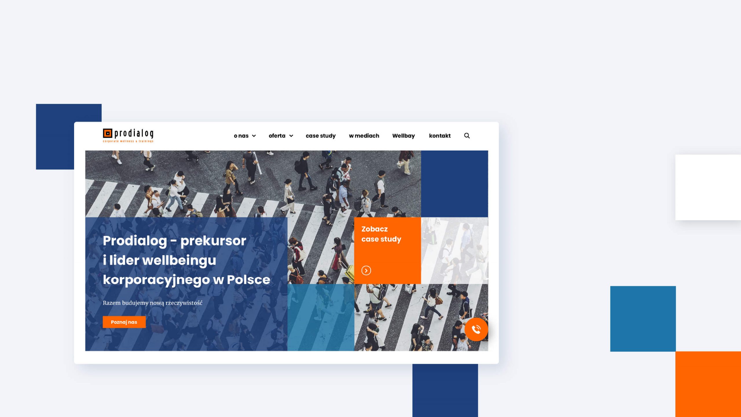
How to graphically tackle the topic of corporate wellbeing?
It was supposed to be simple, elegant, without lotuses and pastels. We referred to the form of the existing logo. We arranged the graphics, just like you can organize everything in your head.
Business color + energy
The addition of blue and navy to the color palette adds freshness and elegance. Transparent square bands make the page light. The orange energy in the CTA buttons directs the user flow exactly as needed. Clean and simple. According to the expectations.
2021