Polish Internet Research
IN THE CIRCLE OF RESEARCH
In this case the total rebranding of the brand meant for us a profound analysis and understanding of the specificity of a completely new industry. PBI is an institution which boasts about its reputation on the market, so our task was a real challenge.
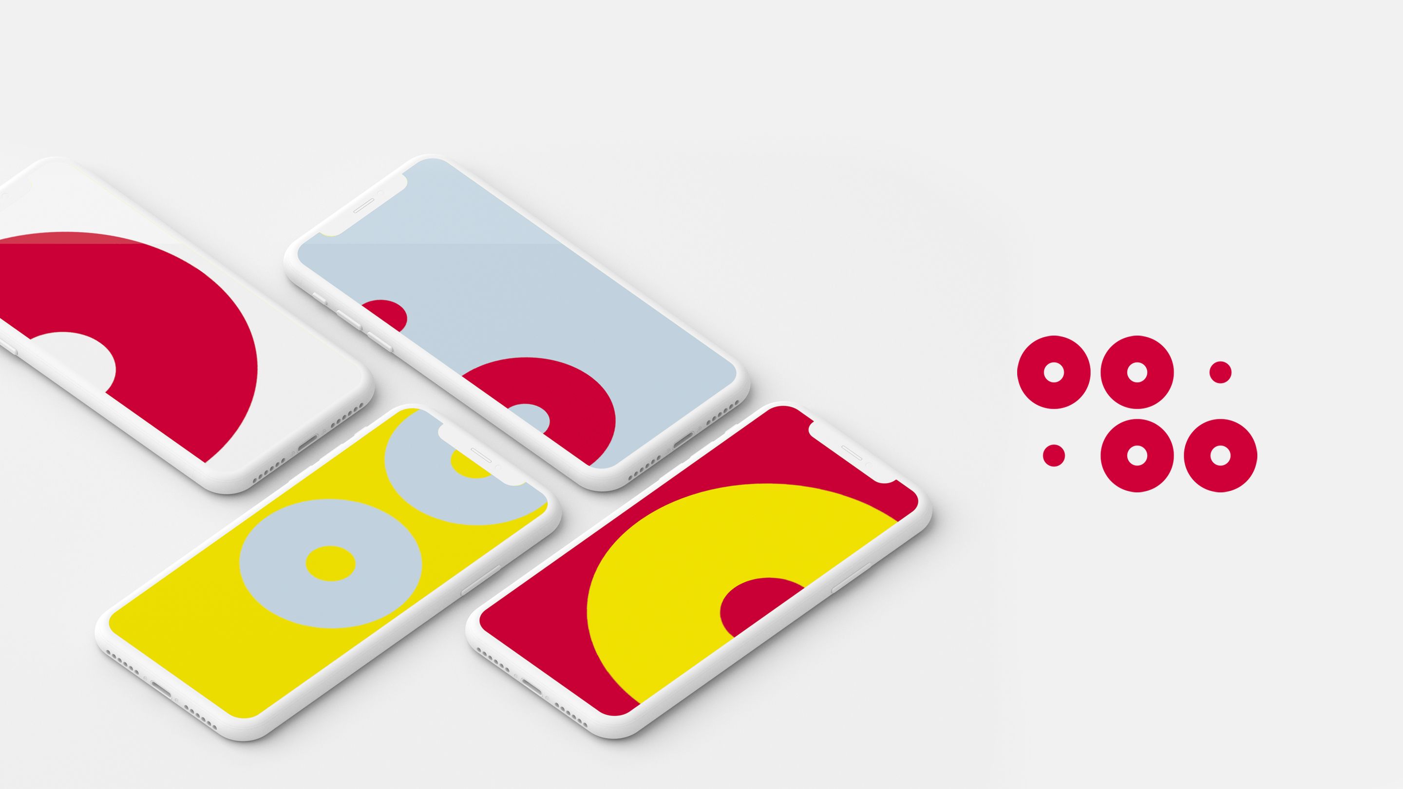
We decided on a modern, minimalistic symbol which refers both to the brand initials and graphic presentation of data in the form as a pie chart. Moreover, a circle is a symbol of a perfect form and it represents the idea of the omnipresent but simple internet communication – so it’s like hitting the center of the shooting target.
ROUND-ABOUT
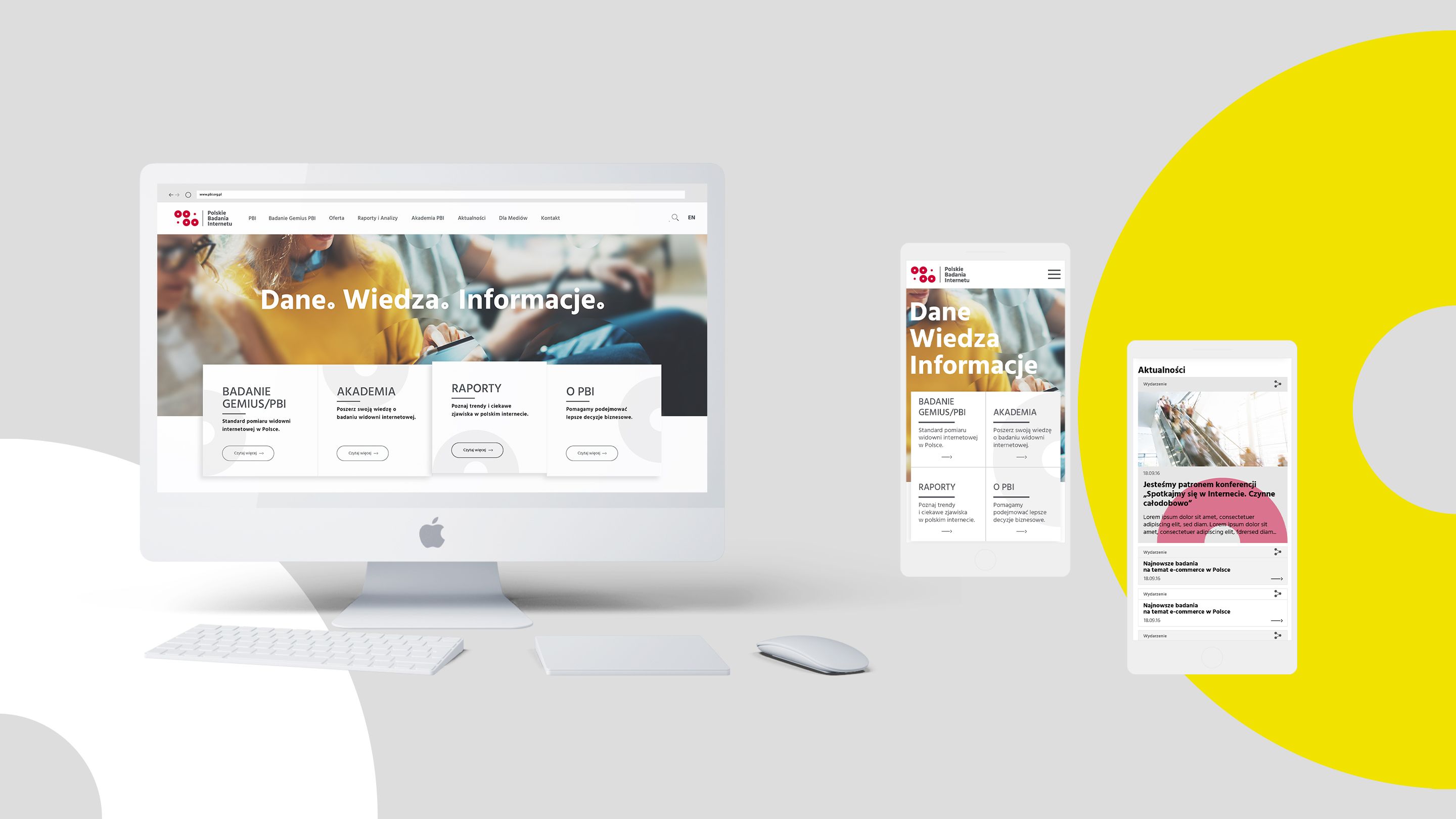
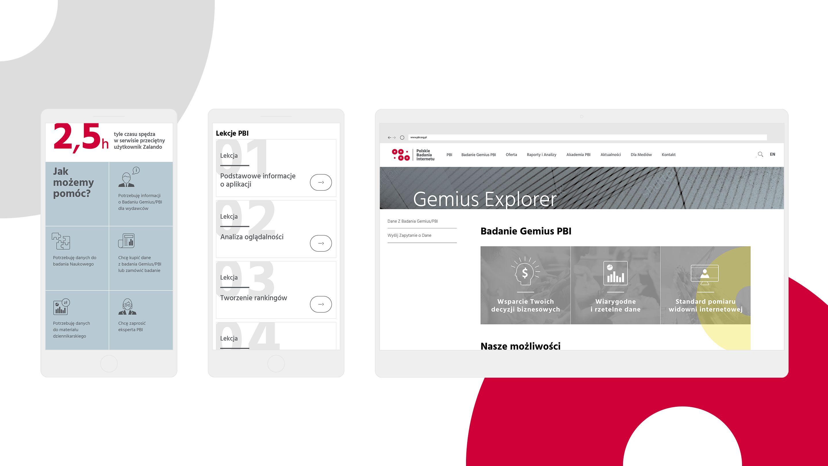
Basing on logotype and refering to it, we’ve redesigned all company materials including website.
Intensive, warm colour pallete combined with circular forms corresponds to games and puzzles. This paradoxically can be easly explained in a serious trade. Can you recognize the company name in logo composition?