OK system
IT’S OK
Rebranding of a well-known brand is always a great challenge. We got a chance to design the OK system app.
Task: update the image
Result: op-art seal ring
It was definitely a good choice.
Concentric letters “O” and “K” seem to be as dynamic as a flying arrow and they form an accurate couple for a brand well-known in Poland. They offer perfect services – something for everyone is like a win-win situation.
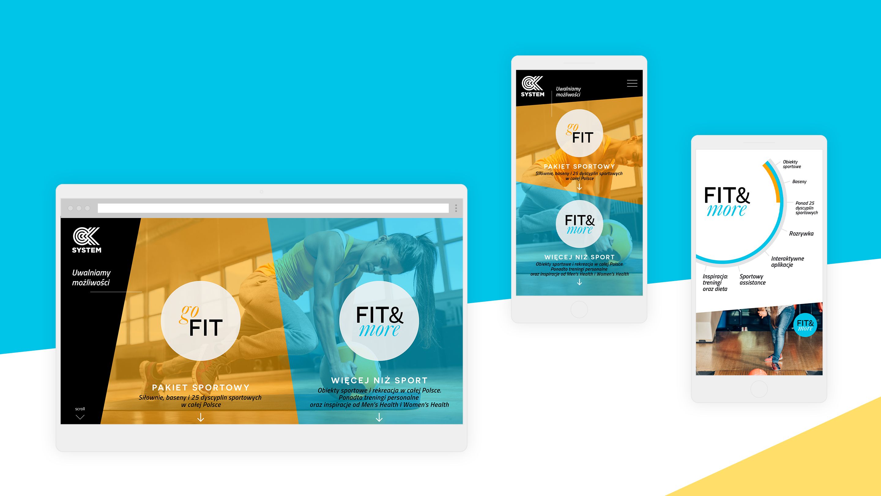
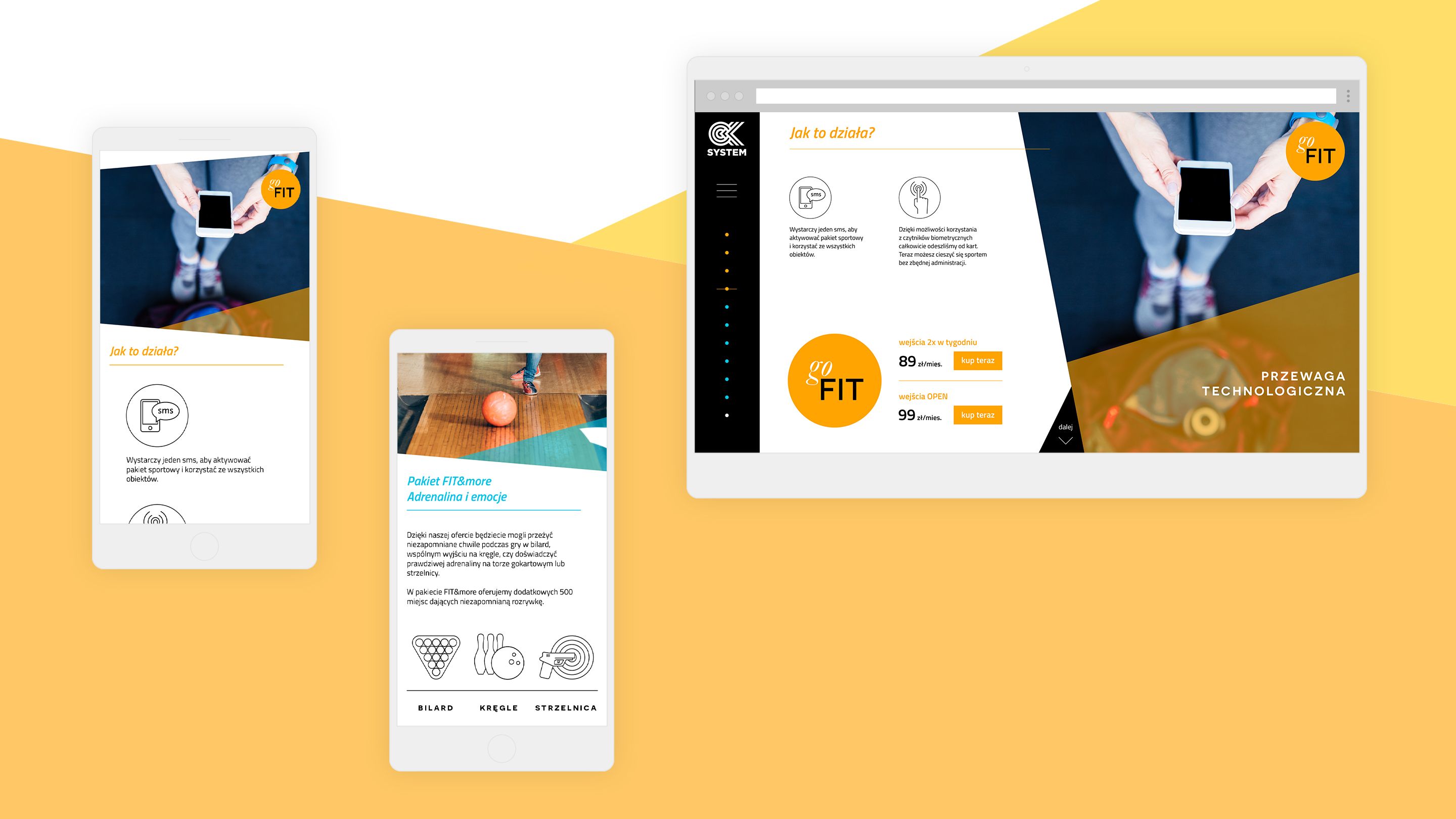
DIAGONAL AND COLOURFUL
The other marketing materials – starting with the website, offer presentation and posters and ending with counter stickers – were designed with diagonal elements of penetrating uniform backgrounds, all in refreshing blue and sunny yellow.