Cyclad
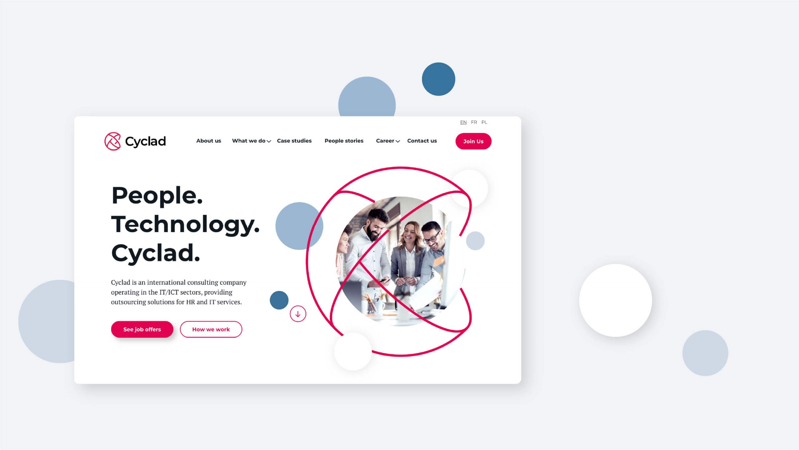
People. Technology. Cyclad.
Complete rebranding of an international consulting company operating in the IT/ICT sectors, providing outsourcing solutions for HR and IT services.
Logo is a combination of the letter “C” with the symbol of the globe, orbit, and atomic molecule. It’s an illustration of technology, development and the smallest elements that build the world around us. Atoms must coexist to build and create. It reflects the brand spirit according to which people together create and develop new technologies.
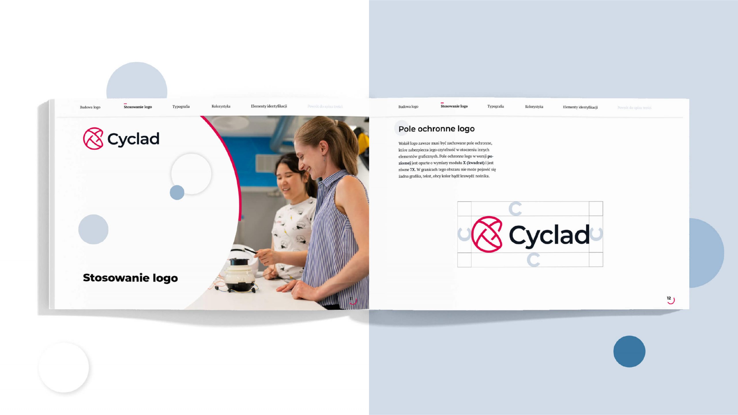
Identification circle
We refreshed the company’s red, added subtle blues, and started a new direction of brand identification.
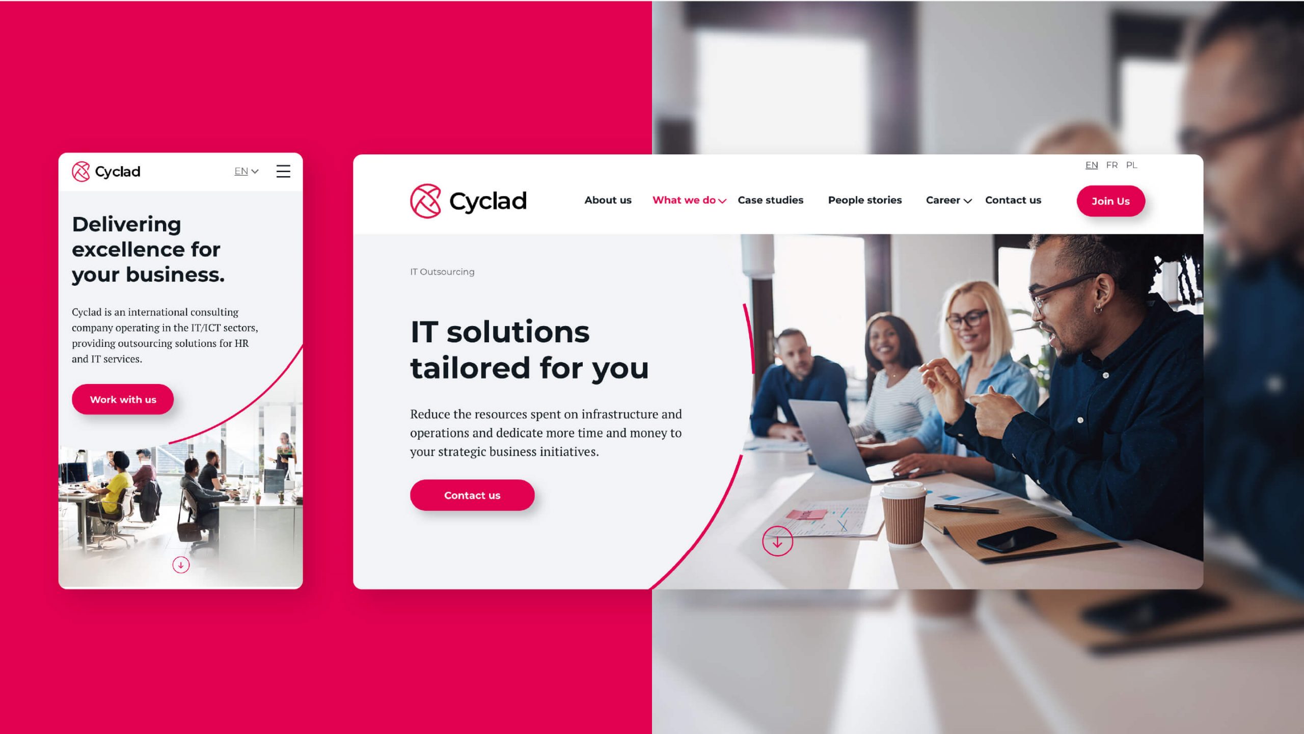
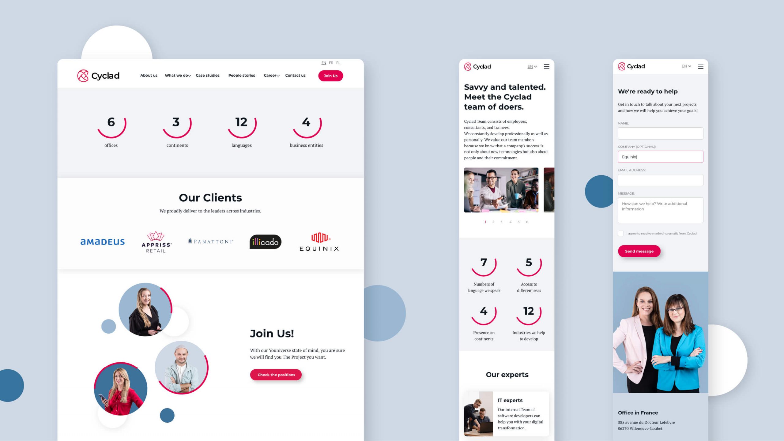
A website, brandbook, package of print & digital materials was created, all in a consistent, modern, and elegant visual.
2021