WATER FOR OXEN, WINE FOR KINGS
As far as wine is concerned almost everything has already been done. Fortunately, our creativity has no limits.
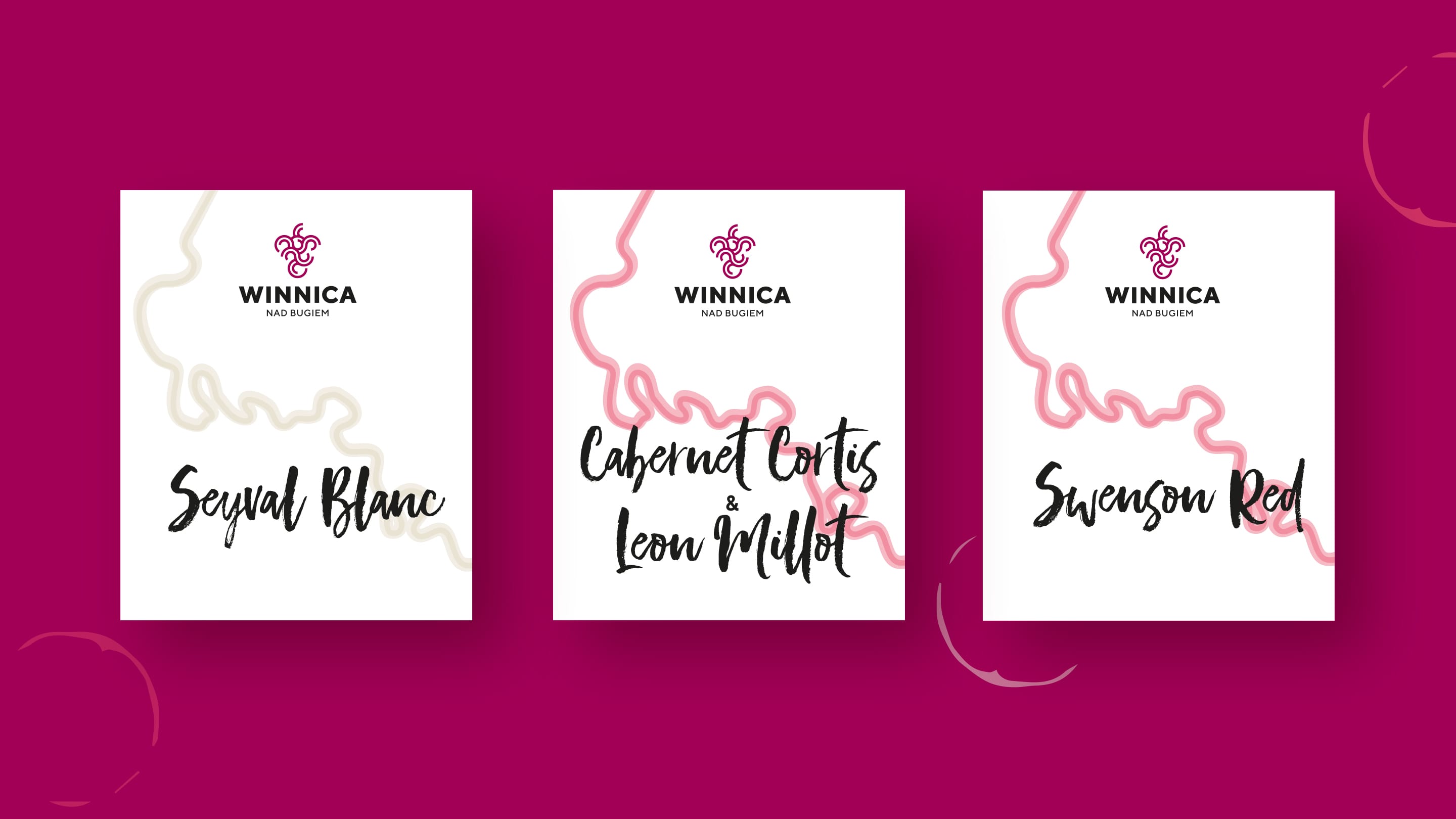
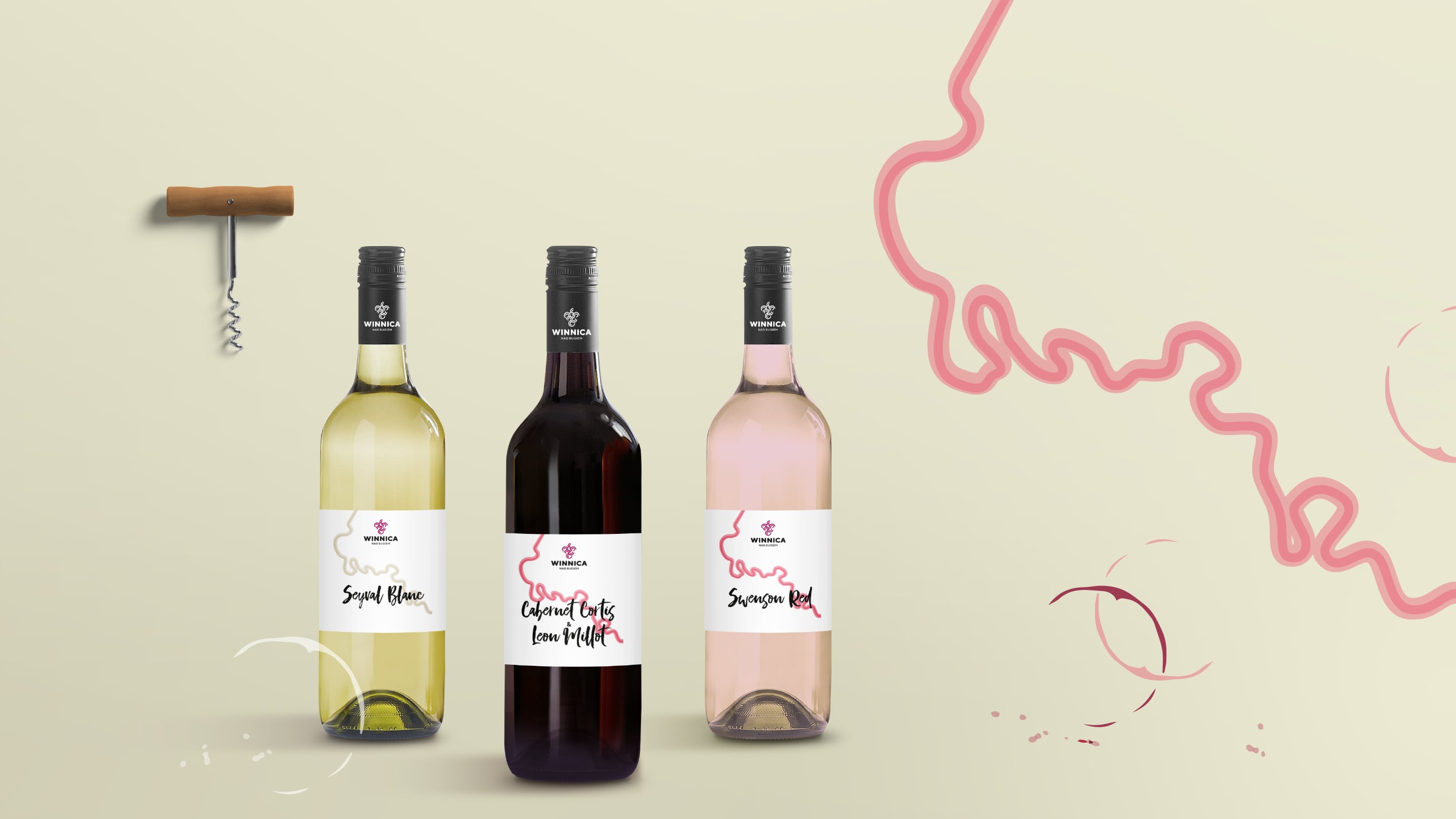
The topic was the following: Polish vineyard upon the Bug River, in the grounds of an old mansion with the ruins of a manor house. Shall we go for retro or rather something modern? Tradition or modernity? The starting point is the twisted course of the Bug River near the vineyard. We weaved the geometric bunch of grapes into the meanders and we got a new, modern sign.
WHITE OR RED?
A series of minimalist labels is an eclectic nod to tradition. We combined the modern logo with the winding river and handwritten typography.
Can we add anything else in this topic? Maybe white or red?
Year 2018