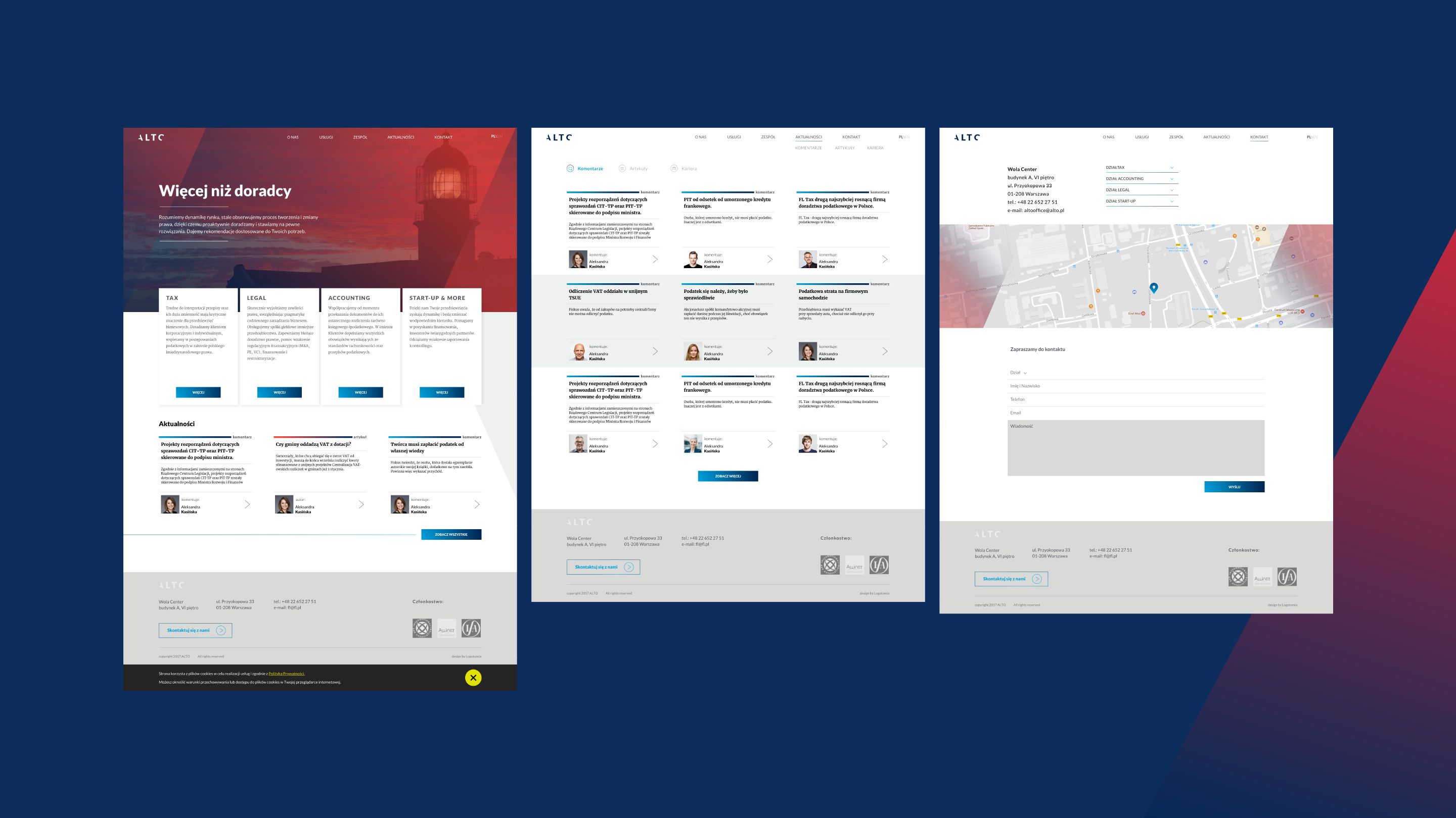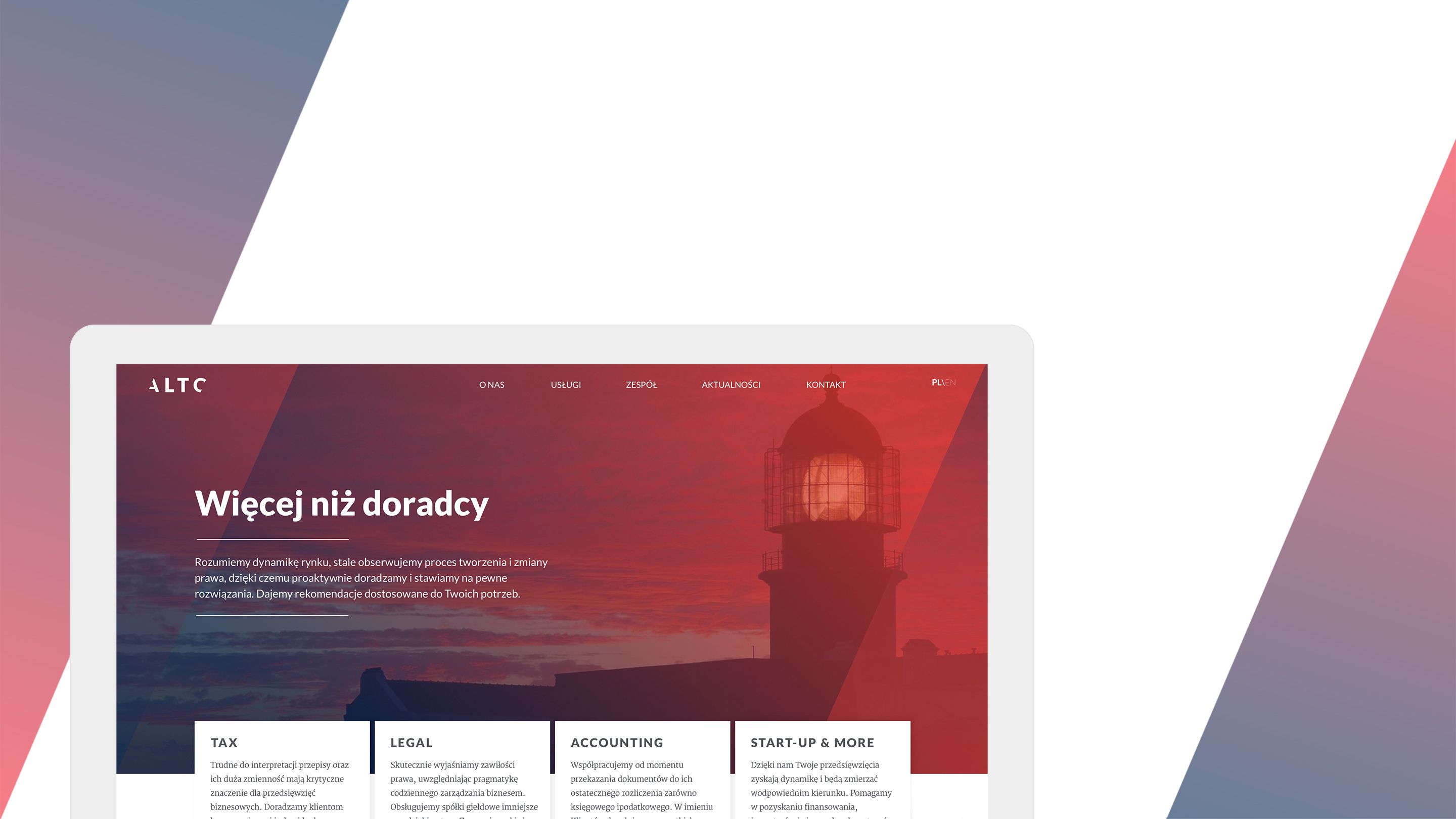
ALTO Advisory
TOTAL MODERNIZATION
We were trusted and given a task of preparing a total rebranding. The dynamic growth of the fl tax company present on the market of tax consulting required modernization of the communication with the client and a completely new graphic image.
We cooperated with a PR agency and started with preparing the communication strategy and inventing a new name – that is ALTO – and new content. The next step were the logo, marketing materials, brand book and website.
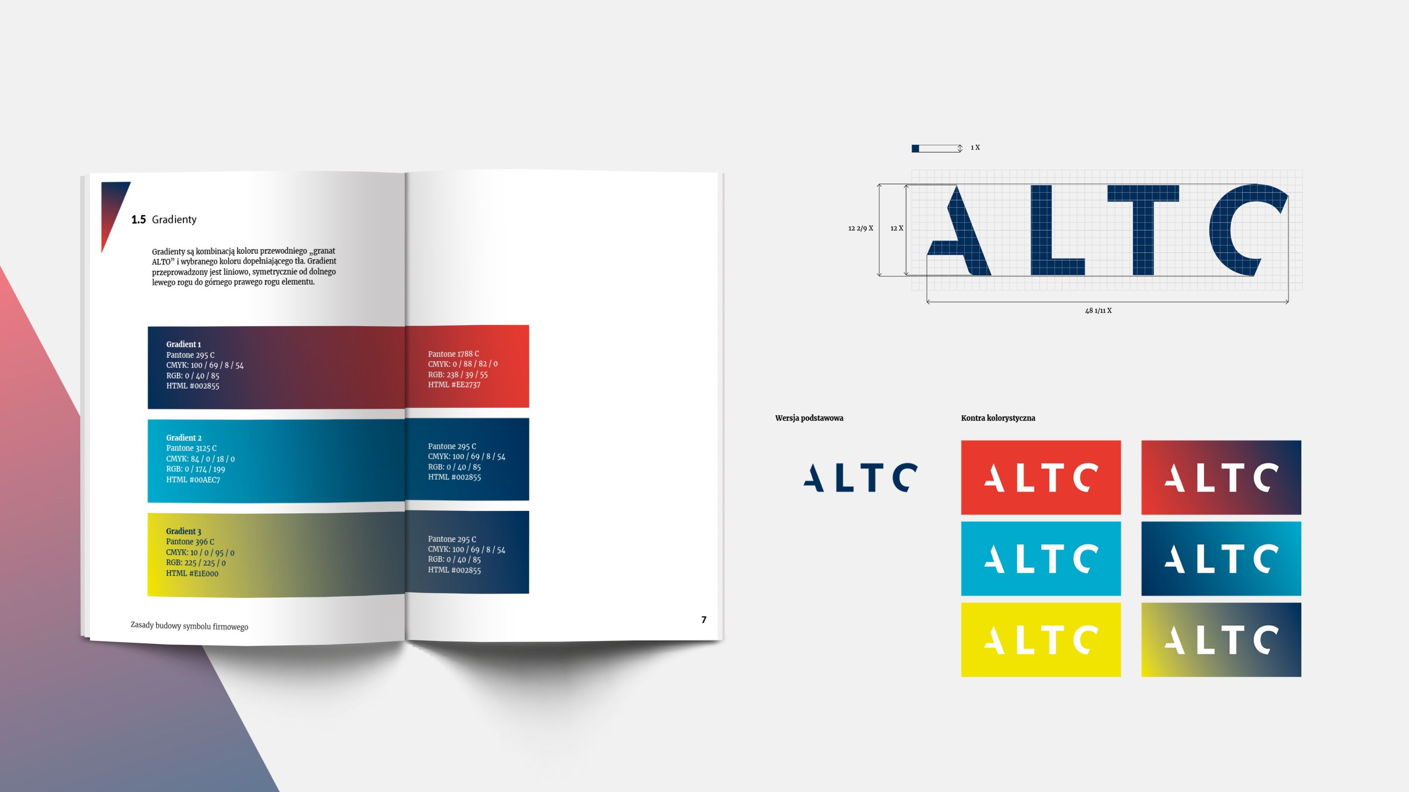
UP UP UP
The symbol is a graphic record of the brand name (ALTO) which means tall in Italian. The slant symbolizes a value growing on the graph. The cuts and diagonal lines
- emphasize the dynamics of the company which optimizes the costs, specializes in tax consulting and start-ups.
- show an immediate reaction of the brand towards the changes on the market.
The clear graphic form is a symbol of simple and transparent communication.